Showing posts with label Illustration. Show all posts

Friday, September 27, 2013

In the Dark and TipJar - Projects to knock your socks off!

Hey all!

I know I haven’t been updating much recently, but that’s because I’m hard at work!  I am proud to announce that I’m part of two awesome Kickstarter projects right now! They are both very cool, and if you like comics, horror, or just art in general, at least one of these projects is for you!

Here’s the low down and dirty -


IN THE DARK ANTHOLOGY

In the Dark is a brand new horror anthology featuring some of the top and up and coming talent in the comics industry today, and is a great chance to get an anthology full of unique voices doing really cool horror tales. In the vein of the old Tales of the Crypt, Creepy, and other classic horror anthologies, you aren’t going to want to miss this!

The project is spearheaded by Rachael Deering, and she was great enough to pair me up with James Tynion IV, a talented writer and all around nice guy who has given me one of most terrifying monsters to draw. Our tale is going to blow you away!

Pledges for In the Dark start as low as $10 for the full version in PDF, and more for the hardcover. There are still some really cool donation reward tiers open, so it’s WELL worth your time and money! Take a look at In the Dark here!


TIPJAR SKETCH COLLECTION


TipJar is a really cool project masterminded by my great friend Nicky Soh and organized by the rad Jen Hickman! This project is a chance to get to support fresh talent, and get to know new artists(and great people) in a very intimate way- Through their sketchbooks.

Every artist knows that for every good drawing, there’s countless sketches and process work that goes into it’s creation. This is a chance to see some of each artists unique work process, as well as a chance to see experimental work that wouldn’t typically be shown portfolios, or even sketchblogs! Each artist has selected the best of their sketchworks, and contributed at least 50 sketches to the project.

Donations for TipJar start at $1. The more you “tip” the more art you’ll get. Even $1 will get you 300 awesome images, and for as little as $10 you can get the full Megabook - 700 pages of awesomeness. There are also increased reward tiers as well, and for $75 you can get the full package, 4 prints, and an original sketch commission of your choice!

Check out TipJar here! $1 isn’t much to ask to support awesome art and keep us going!


Opportunities like this aren’t going to coming around often, and trust me, you’ll want to say you were there when it happened!


Please support these projects by donating, and if that’s more than your situation allows, please share, reblog, and spread the word to your other art loving friends!

Thanks!

Monday, April 15, 2013

Sandman: Dream into Dream


Illustration of Dream from Neil Gaiman's Sandman, published by Vertigo Comics. I sent this one in as an art submission for the San Diego International Comic-Con Souvenir Book, hopefully it'll make it in!

Enjoy!

Wednesday, March 6, 2013

You Never Know: Page Process for Playlist Kickstarter

Zoom in for Full view!


As you may know, I'm currently working on a project called "You Never Know" for an upcoming comic anthology called Playlist , which is being Kickstarted right now!

All of the comics in the anthology are based around songs by different musicians or bands, drawn in different unique styles. This is something awesome that you'll definitely want to be a part of, so check it out!

The song is a sort of Supernatural Horror/Noir tale that is inspired by and based on the song You Never Know by the band Brazil! Here is a breakdown of the page process step by step.

It's pretty self-explanatory but let me just give a little bit of clarification here.

1 - Concept Art
----------------------
After getting the general idea for the story from reading the song I do a rough concept design. This gives me a solid visual for what to think about when I'm drawing the thumbnails and finished pages.


2- Song Analysis
----------------------
This is one of the more exciting parts for me as a storyteller. Since the story was originally written as a song with verse rather than as a comic script, it's up to me to break down each page and panel. This gives me a LOT of freedom and makes the process really enjoyable.


3 - Thumbnails
----------------------
Once I know what's going on each page as far as the song is concerned, now it's up to me to break it down into individual panels. This goes hand in hand with the script analysis part. These thumbnails are VERY rough. If I was working with an editor or published house I imagine they might be a little frightened about these almost illegible scribbles, so I would have to tighten them up more. I probably should anyway, because coming back to these a few weeks later I even had to discern what I was drawing a few times. Regardless, when it's just for me I don't feel the same need to make these totally definite, I want the freedom to play with the layout and panels just a bit when I get to drawing the page.

4 - Pencils
----------------------
Rough pencils. I ink my own work so I'm not as concerned with having a final line, black placement, or rendering as I would if I were handing this off to another artist. This saves me time, as well as makes the inking more exciting for me as I usually do it the same day as the pencils. If I made finished pencils and then inked them it would probably take me close to 15-20 hours, and there's just not enough time in the day for that. These pencils are darkened up significantly in Photoshop so that you can actually see them onscreen.

5 - Inks
----------------------
I think I'm with a lot of artists who ink themselves in that this is my FAVORITE part of making comics. I love coming up with the storytelling and figuring out how to draw the different parts of my story, but the feel of the pens and brushes on the board is really awesome, as well as the variety of marks I can make with them. After inking I erase the pencils, scan, crop, and threshold the inks to get just black and white.


Hope you enjoyed and for all of you interested in making comics I hope this is helpful!


Please check out the Playlist Kickstarter page! We currently have 10 days left to go and it's going to be a tight squeeze for funding! If you found this useful, like comics and/or music, please share it with your friends and back us if it' something you think is cool!

Thanks again!

I use -

Strathmore 500 Series Semi-Smooth 11x17
4H Pencil core and mechanical lead
Micron, Brush, Rapidograph, Marker

Friday, February 8, 2013

ArtBook - Sixty Shades of Blue - Nicky Soh Kickstarter

Recently my good buddy Nicky Soh started a Kickstarter for an art collection book called Sixty Shades of Blue! It looks like an awesome project, and I highly recommend donating to it, or in the least sharing the project with friends who enjoy this kind of stuff as well!

Let me just give you a little background on the project!

Last spring, Nicky started creating small illustrations in his free time as a way of relieving himself of any pressure from his other projects. It was a way to both experiment with style and drawing techniques, as well as cathartic means to draw unusual content. I am lucky enough to own one of these drawings, and I gotta tell you, they are all beautiful.

After amassing an amount of these, and having enough interest from friends and family, Nicky decided to put them into a compilation art book, and share them with the world! He also will include 20 pages of process and preliminary sketches, and has asked myself and 14 other super talented artists to do our own interpretation of his drawings for the book if the project gets funded!

I'm really excited about this project, and I think you should be too!

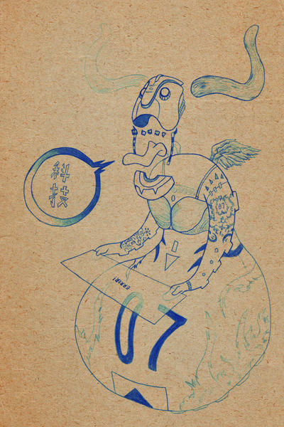
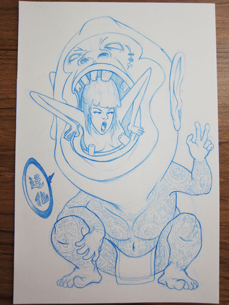
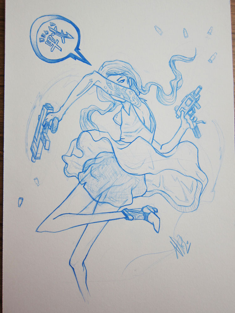
Here are some of my favorites of his blue pencils drawings that you could expect to see in the book!


Crazy Robot

WTF!?


SmokeHead

Bang!Bang! I'm lucky enough to have the original for this one!


Aren't they great! There are 56 more to be seen in this awesome collection! Take a look, check it out, and share the love!

Tuesday, September 18, 2012

Belgariad Cover Process

Hey all! So here's just a quick walkthrough of my first project for my Cover Illustration and Design class!

We are to take an old property and re-imagine it for a modern audience. I decided to do the fantasy novel series The Belgariad. I enjoyed the novels quite a bit and I think they could make a cool graphic novel series.

Here's a rundown of the process!


I start with a rough thumbnail for the composition.


Next I make a tight rough based on the thumbnail.

I lightbox a blown up version of the rough, add details and tighten up the rough.


Finally, I ink it!


I did forget to mention that I did a small black placement study on a small printout of the pencil page so that I didn't have to place it all with in the pencil stage.

Enjoy!


Wednesday, August 29, 2012

Morning Music


Something I did for fun this morning before work.

Get lost in the music.

Tuesday, August 21, 2012

For Toppi

Today marks the passing of one of the greatest illustrators of the 20th Century, Sergio Toppi. He was a master of his art and a huge inspiration to me, as well as countless other illustrators, comic artists, and graphic designers around the world.

This is a little something I drew today in honor of him, in his style, as a memorial for him.

He will be sorely missed.

Friday, August 17, 2012

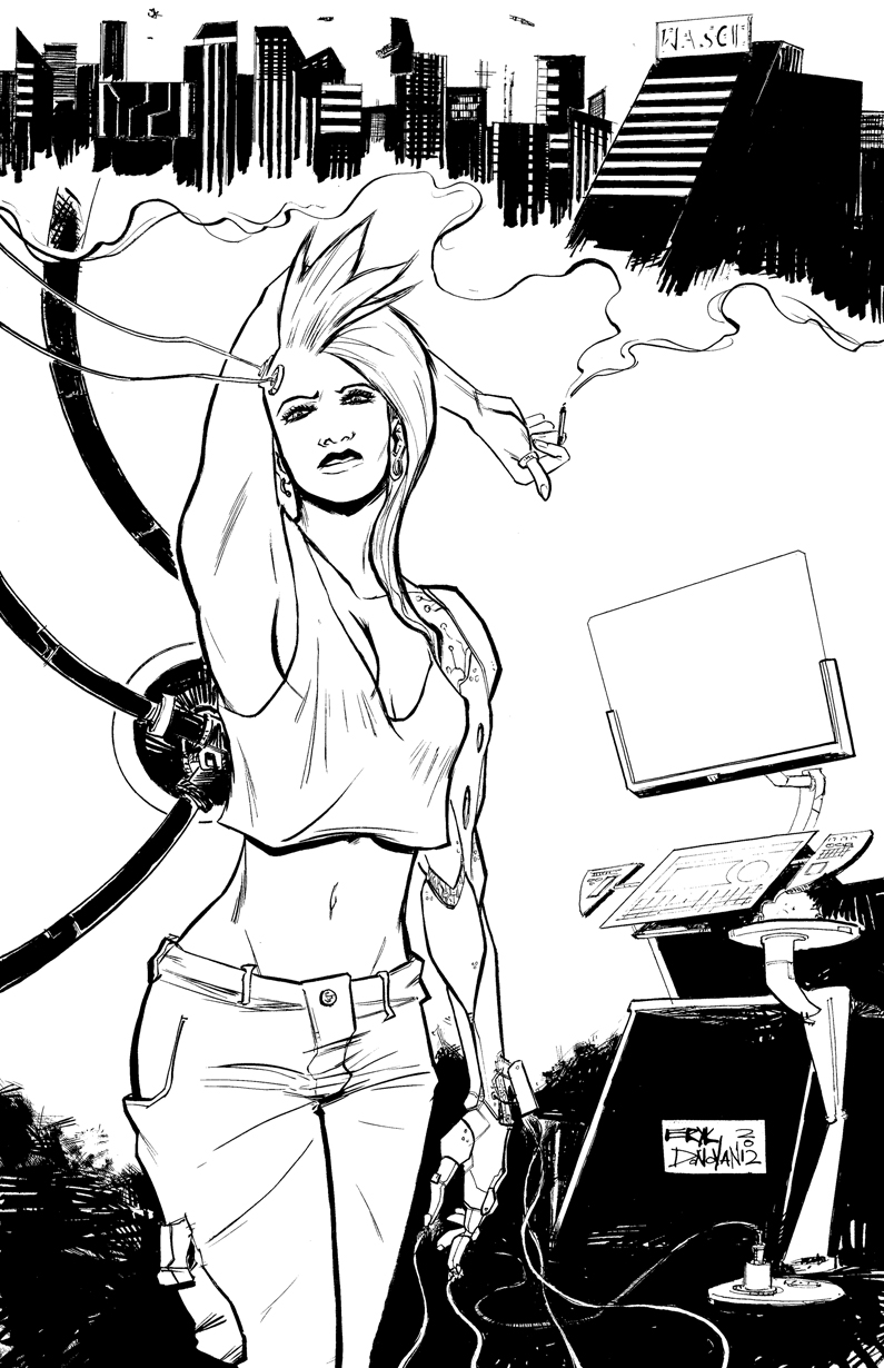
Cybertechnik


Here's the lines for a print I'm making for the upcoming Baltimore Comic-Con! I'm really excited to go, and I want to have some new art to show and doing sketches for people!

I'll have more info coming soon, as I find out my table numbers, as well as let everyone know what to expect price-wise for sketches and stuff at the con!

Hope to see you there!

Saturday, May 26, 2012

HeroesCon Fundraiser!

Hey Everybody! It's the last week of classes and finals for me, which means crazy business! I'll fill people in about it once everything has settled at bit.

Main thing right now though is that I am not going to be able to work over the summer break like I thought, which puts me in a bit of a bind! I'm planning on going to HeroesCon next month, but I need to make some extra funds before then. This means fundraising commissions!


I am opening up commissions beyond sketch commissions for this! These will be full completed pen and ink illustrations or drawings of whatever you want (nothing gross). Color can be added for just a few bucks more!

Prices as follows!


9x12 $50
11x14 - $75
11x17 - $100

Color prices -
9x12 - $5
11x14 -$10
11x17 - $15


I  can ship you the original art for $8 shipping (international we can negotiate) or you can come pick up your art at HeroesCon from me in person!

Or if you have it in your heart, you can just donate to me here!


Wednesday, April 18, 2012

The Fountain - Illustration

Ink study of Darren Aronofsky's The Fountain movie poster.

Did this for my advanced inking class.  I really like this poster, it has alot of cool stuff going on visually, and I thought it would be a great challenge to try and translate this into black and white and line.

Pen and Ink on Bristol
9x12

Thursday, April 12, 2012

Tuesday, April 3, 2012

Ghetto Illustration


Ink Drawing done for my inking class at SCAD.

I have a sad little story about this drawing. I left the original of this image in the scanner at Wallin Hall about two and a half hours before the building closed. I didn't realize until the next morning, and went over immediately, and the drawing was gone. People leave drawings lying around that building all the time, so I know it was probably stolen. I asked around the hall and none of the professors or administrators had seen it, nor had it been turned in.

Sad.

If anyone ever sees the original of this image or an unauthorized copy of it, please email me and let me know at erykdonovan@yahoo.com

Regardless, I'm glad I have the image that I can still share with everyone!

8x6 on 2 ply bristol board
Pen and Ink

Wednesday, January 4, 2012

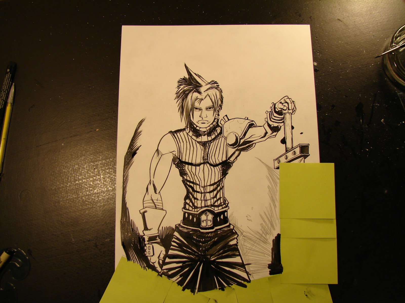
Cloud Strife Pinup - Process to Completion

I need a background for my twitter. I'm tired of having the same old twitter background, I'm an illustrator dammit and I need to show it!

Cloud Strife from Final Fantasy 7 has long been a favorite character of mine. I think at this point it is for a more nostalgic reasons rather than the stylistic inspirations that the game impressed on me when I was thirteen. Regardless, I seem to end up drawing him every so often, and I figured I might as well as a background!

So here we go! For this process I tried something a little different from last time. I do roughs in both pencil and ink, allowing me to really SEE the black and how it will look in the final version. I recently came to own a rough from a cover done by one of my favorite artists, and he used a similar process for the cover, so I figured I'd try it out! 

I start with a basic sketch with some lines of action to get the basic composition. I use the triangle as a straightedge to rule out the guideline of the buster sword.

More Sketching


By now I have a good basis, and I start working in some details. I'm not incredible concerned with anything looking "final" this phase is all about spontaneity  and getting a good layout. I also lay in the compass line at the bottom where I'll be cutting the image off in the final piece.


I start adding details to Cloud's body and accessories, as well as work in a bit of the face. I don't like the eyes, and end up going over them and redrawing a number of times. You can see the residue from the pencil. THIS is a really good reason why to work on a separate piece of paper for layout first. This residue could both resist ink on the final, as well as be an eyesore.

Those EYES!!!!


Still working Cloud's eyes, but I'm happy with them now and move around a bit to add more elsewhere.

Pencils are done. I have enough detail, but this isn't the final pencil, so loose is still good. I pull out my brush to lay in black.
Cloud Strife Ink Rough
All brushed with ink. I pay attention to line quality and black placement, but I'm not worried about much else. The primary objective here is to get an idea of what lines I'll actually be basing the final off of, and spotting out where I'll have blacks and alot of textures. It helps me to really visualize the final work, but without the pressure of working on the board for the final piece.

My next step is to attach the copy sheet to a lightbox and copy the piece over to the board.


I add some textures with pencil and get the lines I want. I fix the eyes a little more again. Some of the ink is a little wet on the back, and leaves some spots that I think will be cool for a splatter effect, so I pencil them in too.I also extend the handle of the sword, when I realize it's a little bit too short.

Now it's time to mask it off. I don't always mask off at the beginning, but there are enough lines here that would be going past the cutoff, I need to be safe. The graphic quality I want is pretty integral to the composition and there are too many chances to mess it up.
I use a tech pen and ink in all the ellipses first. Using a template is very key, freehanding these with a techpen is asking for trouble.
Oops.
Next I pull out my G-Nib to ink the handle of the sword, but the nib is a little too old and bleeds too much ink on the edge of my triangle. I am using a triangle with an inking edge for these lines, this should prevent this sort of accident, but since the nib is old or dirty it unfortunately doesn't matter in this case. I'll have to fix this later.
I ink in the face with the same nib (I still haven't figured out I should just use a new one) and it works fine up until I go back up to ink the other side of the grip. Same problem.
You'd have thought I learned.
I have to just use a new nib. Plain and simple.
I've had a few problems, but these things happen. I finish the sword with techpens, I lose patience with the nibs. After this I pull out the brush and start inking the more organic lines.
More textures and line work I move over the line of the pants to pop the hand forward a little more.
Keep texturing.
More textures. I am using hatching and cross hatching to slowly build up grays and blacks as well as give some form. I'm alternating between the brush and nib for different lines, using the nib for harder edges, and the brush for soft ones.

Textures and the work on the figure is mostly finished, and it's right around now that I realize that the whole focus is going to end up on his crotch... not his head. This is obviously going to be a problem for a few different reasons, so I realize I need to fix this.

As I spot in the black areas, I add alot more to the lower section of the figure. This will drop it into the black design, and prevent it from being as much of a focus. I also mask off the sword so that I can spot out the blacks on the left without hurting the image.


Black design is pretty much done. But there are a few spots that just don't look appealing and need a fix. 


Fixed that up! Added some more smaller textures and blacked out a fair amount on the glove. 

Mask off for the splatter.

 
I add some black splatter effects with a toothbrush and black ink. It gives the image a grittier look and provides visual interest for some of the negative space.


Time for touch ups! I use white gouche and a few drops too many of water. The white out doesn't quite white out, and instead makes a nasty gray. Gotta hate it. 

Finally done. I add some white splatter with white ink, and it's strong enough to cover over the nasty spots.  Once it's scanned in the white won't be visible anyway and it'll all be fine!
Signed and done!
The final scanned version! I'm pretty happy with how this turned out! I'll have it colored in the near future for the background of my twitter.

A few things about this process.

This process is obviously more time consuming than the previous I showed, which involved more drawing on the actual board with pencil, however it can help quite a bit with preventing mistakes or messiness( the problems I had re-working the eyes over and over). I think a process like this will be very effective for large illustrations or covers for novels or books, whereas smaller sketches may may not benefit from this as much.

I can see this also being effective for a comic page, but perhaps on a smaller scale. Working out the kinks and most of the blacks on a smaller page, then blowing it up to a larger size and putting it on the final board.

I hope you enjoyed, keep tuned for some new updates on classwork I'm doing, and some new works and progress.