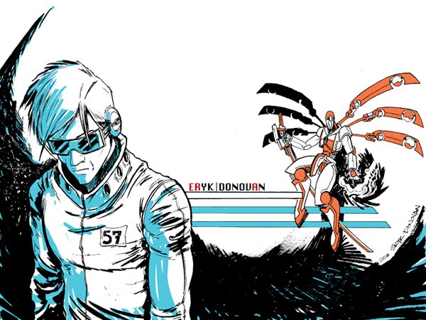
I need a background for my
twitter. I'm tired of having the same old twitter background, I'm an illustrator dammit and I need to show it!
Cloud Strife from Final Fantasy 7 has long been a favorite character of mine. I think at this point it is for a more nostalgic reasons rather than the stylistic inspirations that the game impressed on me when I was thirteen. Regardless, I seem to end up drawing him every so often, and I figured I might as well as a background!
So here we go! For this process I tried something a little different from last time. I do roughs in both pencil and ink, allowing me to really SEE the black and how it will look in the final version. I recently came to own a rough from a cover done by one of my favorite artists, and he used a similar process for the cover, so I figured I'd try it out!
I start with a basic sketch with some lines of action to get the basic composition. I use the triangle as a straightedge to rule out the guideline of the buster sword.
 |
| More Sketching |
By now I have a good basis, and I start working in some details. I'm not incredible concerned with anything looking "final" this phase is all about spontaneity and getting a good layout. I also lay in the compass line at the bottom where I'll be cutting the image off in the final piece.
I start adding details to Cloud's body and accessories, as well as work in a bit of the face. I don't like the eyes, and end up going over them and redrawing a number of times. You can see the residue from the pencil. THIS is a really good reason why to work on a separate piece of paper for layout first. This residue could both resist ink on the final, as well as be an eyesore.
 |
| Those EYES!!!! |
Still working Cloud's eyes, but I'm happy with them now and move around a bit to add more elsewhere.
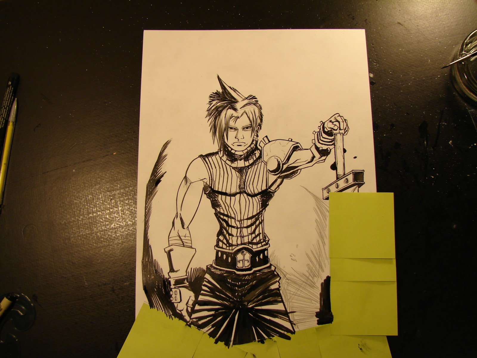
Pencils are done. I have enough detail, but this isn't the final pencil, so loose is still good. I pull out my brush to lay in black.
 |
| Cloud Strife Ink Rough |
All brushed with ink. I pay attention to line quality and black placement, but I'm not worried about much else. The primary objective here is to get an idea of what lines I'll actually be basing the final off of, and spotting out where I'll have blacks and alot of textures. It helps me to really visualize the final work, but without the pressure of working on the board for the final piece.
My next step is to attach the copy sheet to a lightbox and copy the piece over to the board.
I add some textures with pencil and get the lines I want. I fix the eyes a little more again. Some of the ink is a little wet on the back, and leaves some spots that I think will be cool for a splatter effect, so I pencil them in too.I also extend the handle of the sword, when I realize it's a little bit too short.
Now it's time to mask it off. I don't always mask off at the beginning, but there are enough lines here that would be going past the cutoff, I need to be safe. The graphic quality I want is pretty integral to the composition and there are too many chances to mess it up.
I use a tech pen and ink in all the ellipses first. Using a template is very key, freehanding these with a techpen is asking for trouble.
 |
| Oops. |
Next I pull out my G-Nib to ink the handle of the sword, but the nib is a little too old and bleeds too much ink on the edge of my triangle. I am using a triangle with an inking edge for these lines, this should prevent this sort of accident, but since the nib is old or dirty it unfortunately doesn't matter in this case. I'll have to fix this later.
I ink in the face with the same nib (I still haven't figured out I should just use a new one) and it works fine up until I go back up to ink the other side of the grip. Same problem.
 |
| You'd have thought I learned. |
I have to just use a new nib. Plain and simple.
I've had a few problems, but these things happen. I finish the sword with techpens, I lose patience with the nibs. After this I pull out the brush and start inking the more organic lines.
More textures and line work I move over the line of the pants to pop the hand forward a little more.
 |
| Keep texturing. |
More textures. I am using hatching and cross hatching to slowly build up grays and blacks as well as give some form. I'm alternating between the brush and nib for different lines, using the nib for harder edges, and the brush for soft ones.
Textures and the work on the figure is mostly finished, and it's right around now that I realize that the whole focus is going to end up on his crotch... not his head. This is obviously going to be a problem for a few different reasons, so I realize I need to fix this.
As I spot in the black areas, I add alot more to the lower section of the figure. This will drop it into the black design, and prevent it from being as much of a focus. I also mask off the sword so that I can spot out the blacks on the left without hurting the image.
Black design is pretty much done. But there are a few spots that just don't look appealing and need a fix.
Fixed that up! Added some more smaller textures and blacked out a fair amount on the glove.
 |
| Mask off for the splatter. |
I add some black splatter effects with a toothbrush and black ink. It gives the image a grittier look and provides visual interest for some of the negative space.
Time for touch ups! I use white gouche and a few drops too many of water. The white out doesn't quite white out, and instead makes a nasty gray. Gotta hate it.
Finally done. I add some white splatter with white ink, and it's strong enough to cover over the nasty spots. Once it's scanned in the white won't be visible anyway and it'll all be fine!
 |
| Signed and done! |
The final scanned version! I'm pretty happy with how this turned out! I'll have it colored in the near future for the background of my
twitter.
A few things about this process.
This process is obviously more time consuming than the previous I showed, which involved more drawing on the actual board with pencil, however it can help quite a bit with preventing mistakes or messiness( the problems I had re-working the eyes over and over). I think a process like this will be very effective for large illustrations or covers for novels or books, whereas smaller sketches may may not benefit from this as much.
I can see this also being effective for a comic page, but perhaps on a smaller scale. Working out the kinks and most of the blacks on a smaller page, then blowing it up to a larger size and putting it on the final board.
I hope you enjoyed, keep tuned for some new updates on classwork I'm doing, and some new works and progress.


